Standing at the edge of understanding

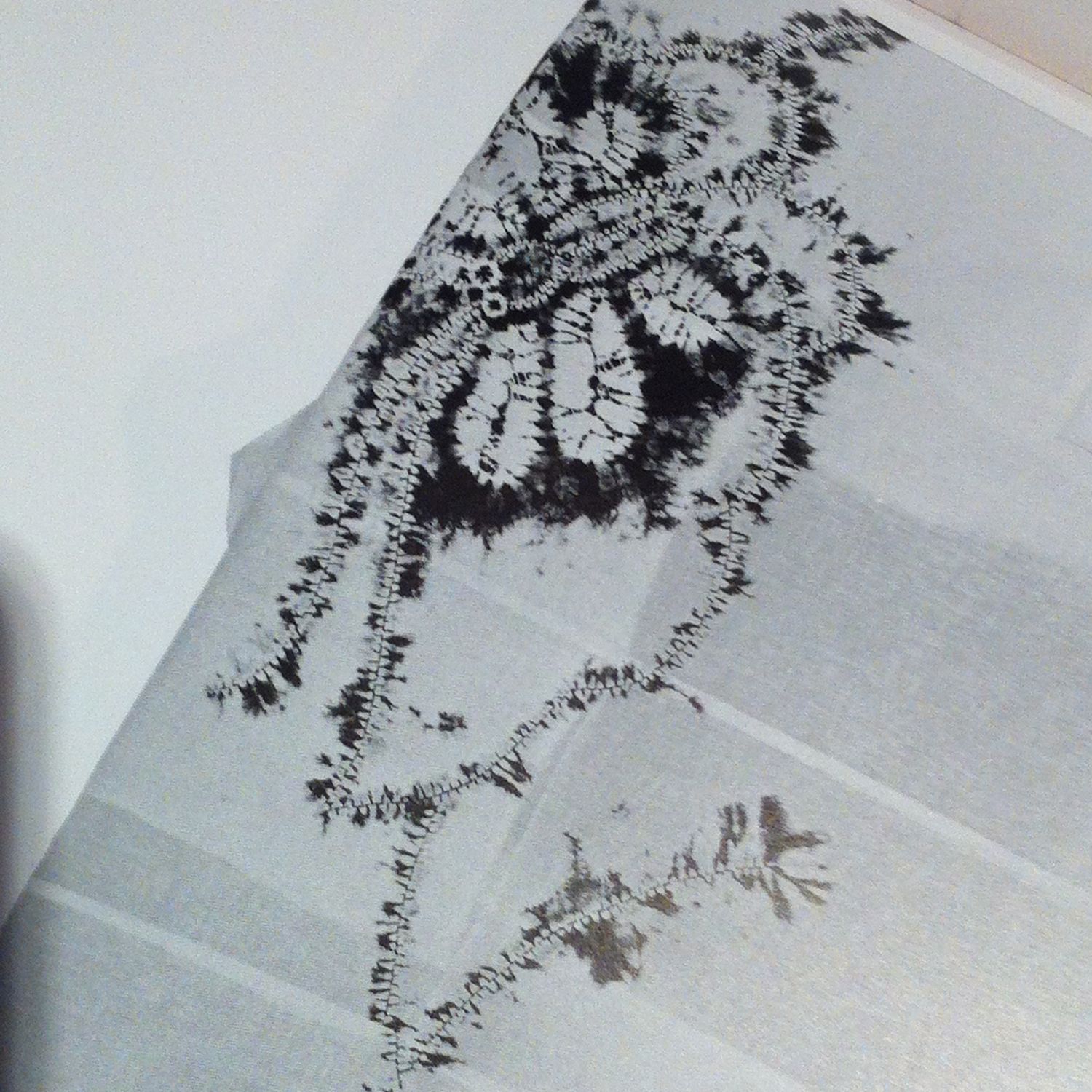
The feelings you get, that thinning out that comes from going into limbo, out to the edge of your understanding and stand there reaching, reaching into a thin layer of unknowns, stuff to swim through without body or substance, without breath, without substantiation or reassurance, never knowing where it leads or what it’s made of, or what it’ll be like, and you float and struggle and gasp, it brings nausea and fear, strange body functions and doubt - much doubt - it’s like falling but never arriving anywhere, never hitting anything unless it’s a new concept, just the fear of falling - but from this leap comes real creation, for when it finally arrives, when it lands, when it is grasped, gasped, inhaled, coaxed into existence, it’s the craziest, most wonderful thing in the world. It’s better than anything else. It’s like falling in love not gradually but in a single moment. It is that moment of the realisation of love, not where it leads or how long it’ll last or what it means, just the heart-beating, stomach sinking, painfully-grabbing moment of Yes! This is it - then it’s gone and one lives with the taste of it having been. You always have some end result, but it always needs to be renewed, refreshed, never having the same original freshness of the first moment, the first kiss of creating.
— Agnes Denes

More about Agnes Denes here

Music on. Stitching.

I am in stitch mode.  Listening to a mega playlist on repeat.  And reflecting on what I'm trying to do.  

Stitch 00.jpg

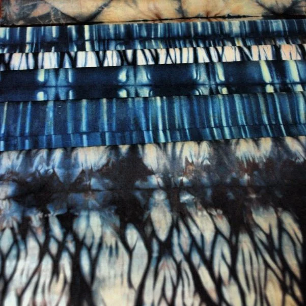
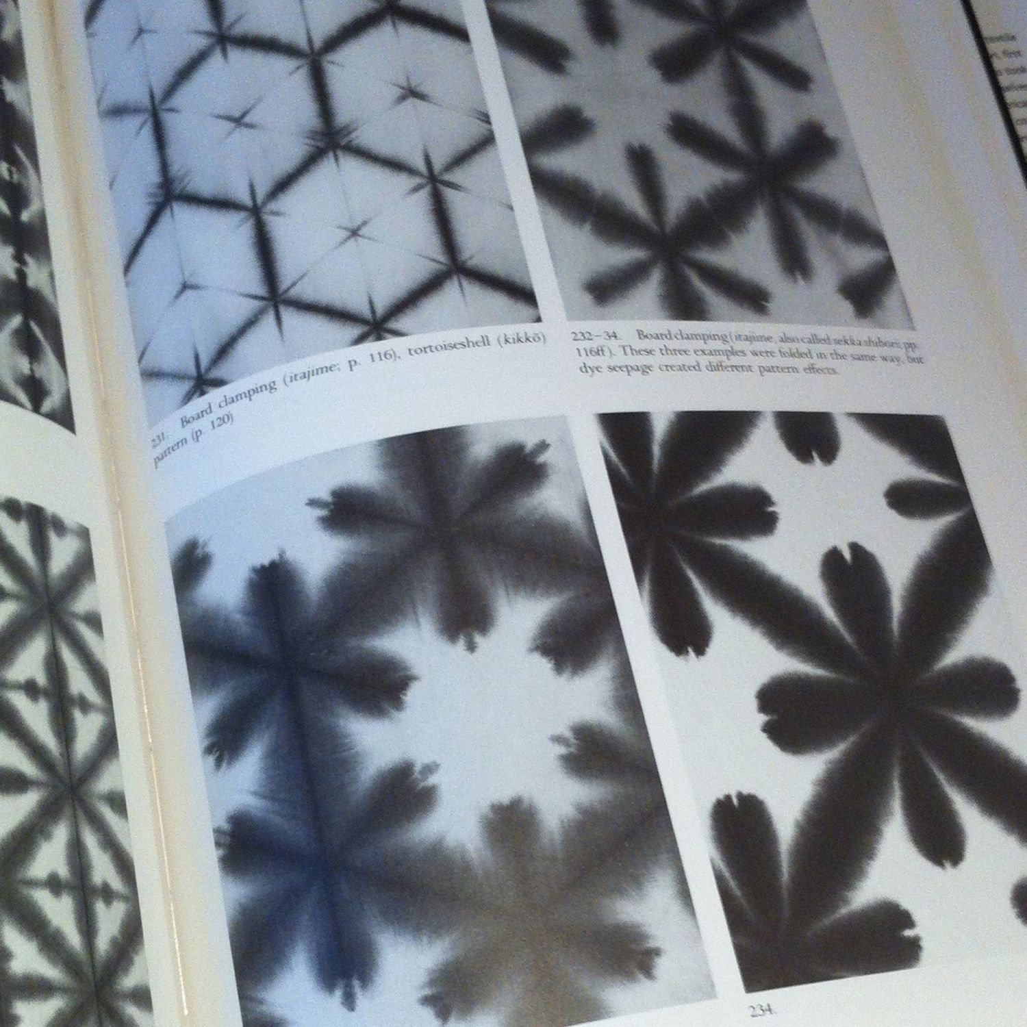
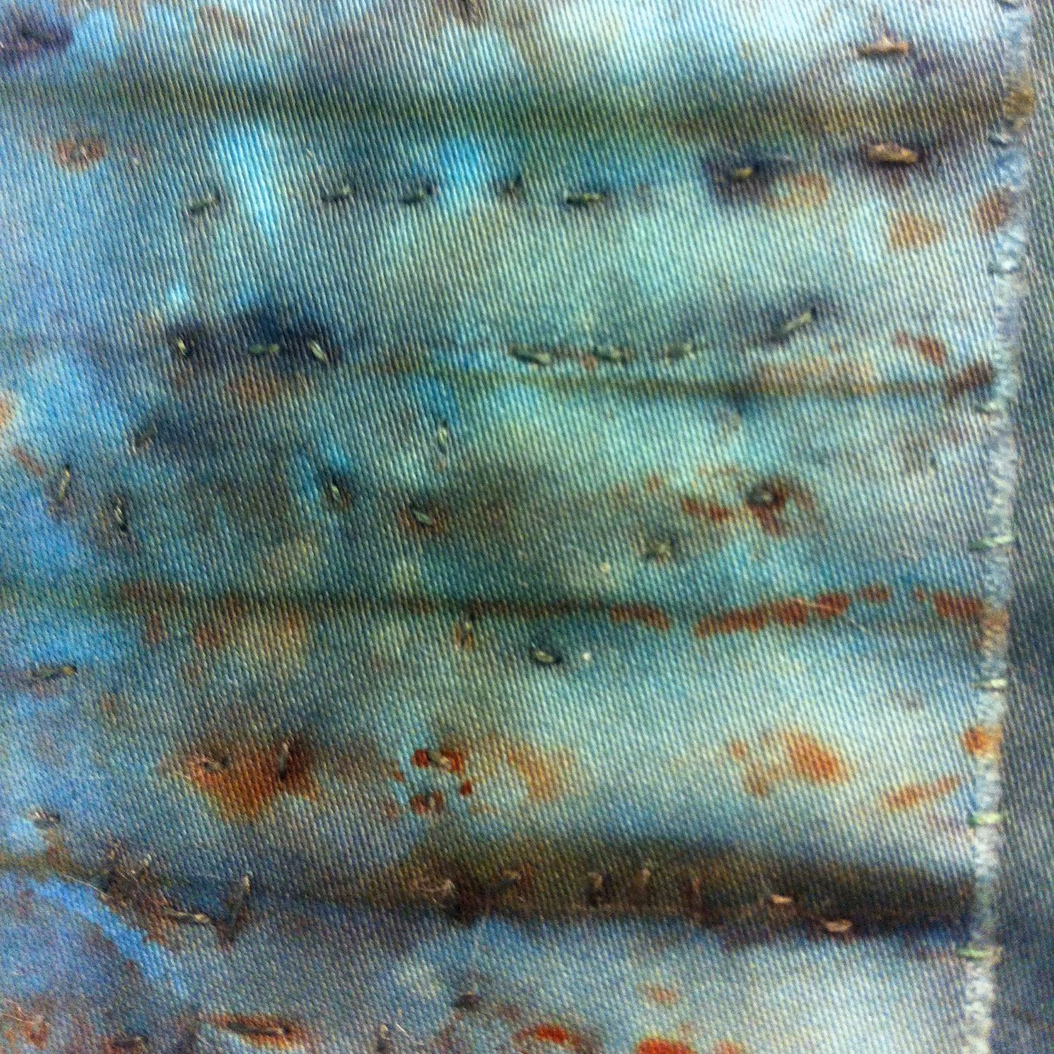
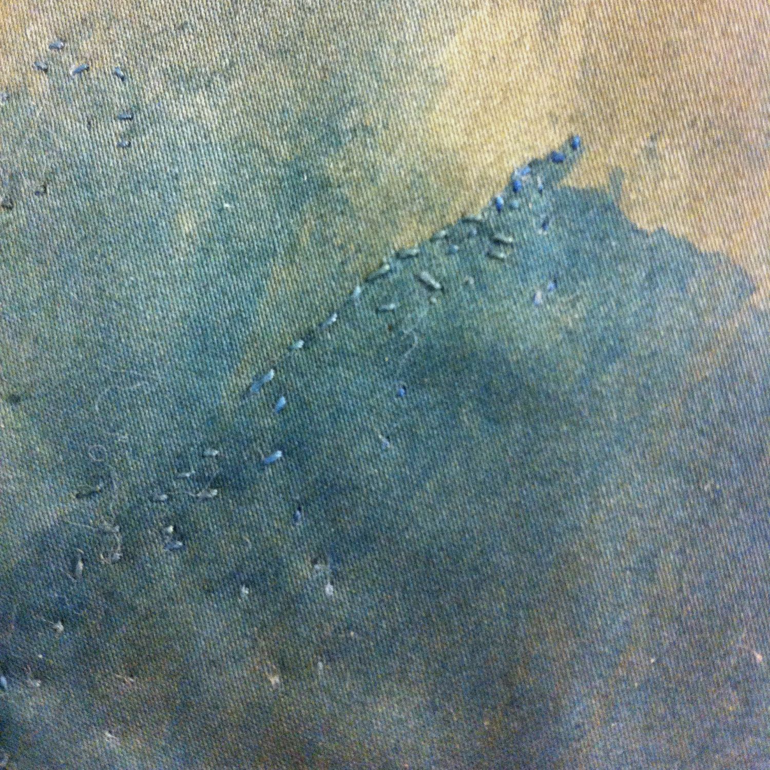
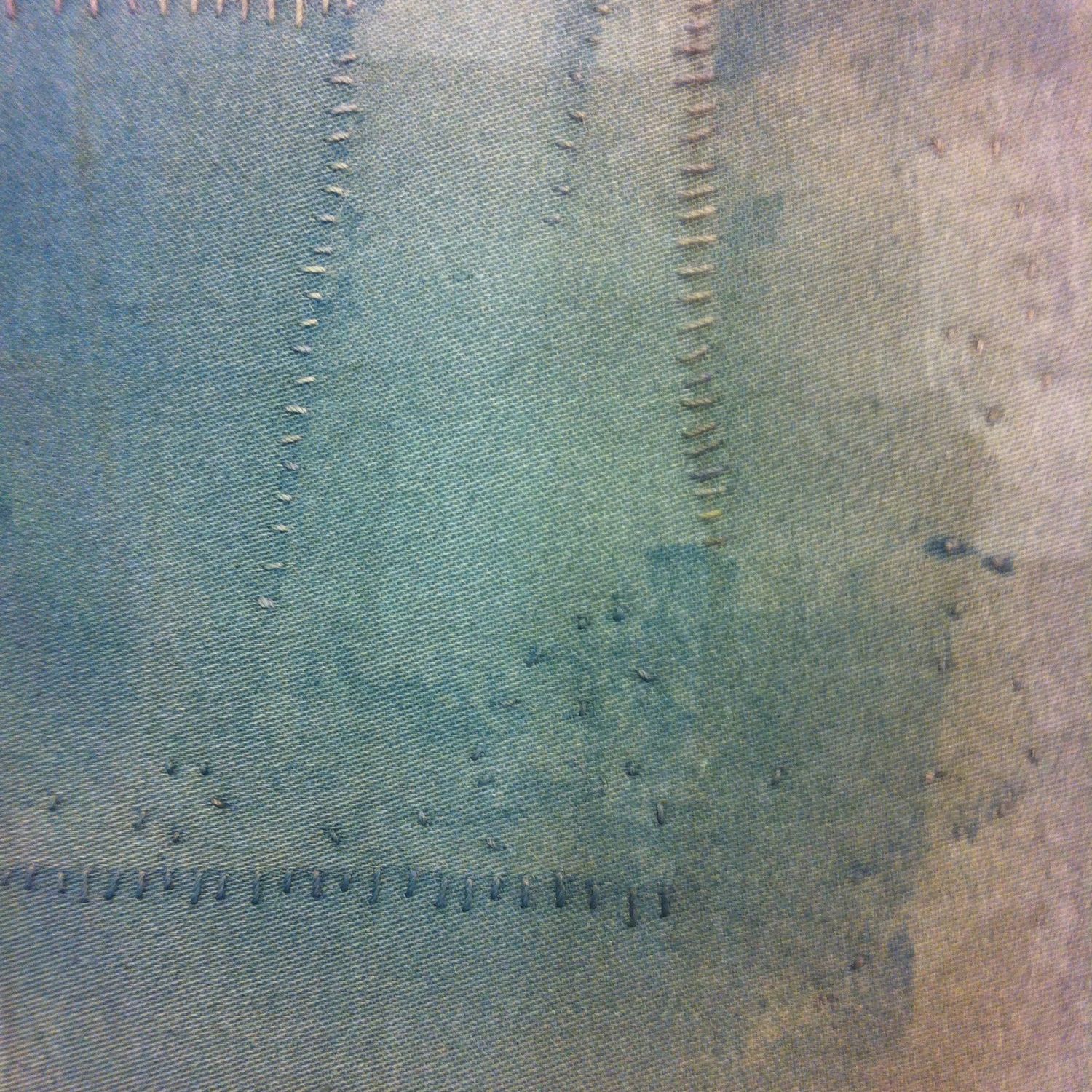
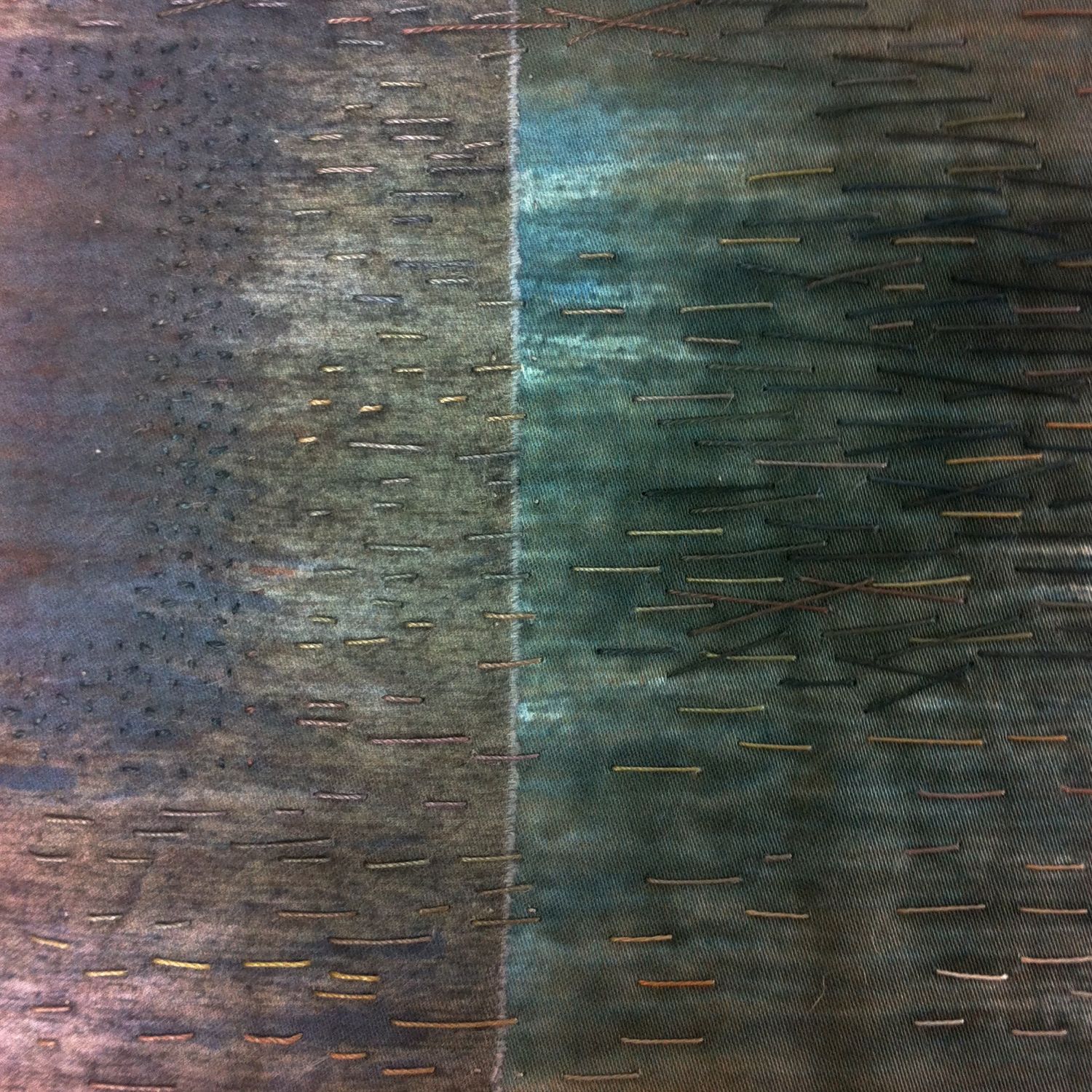
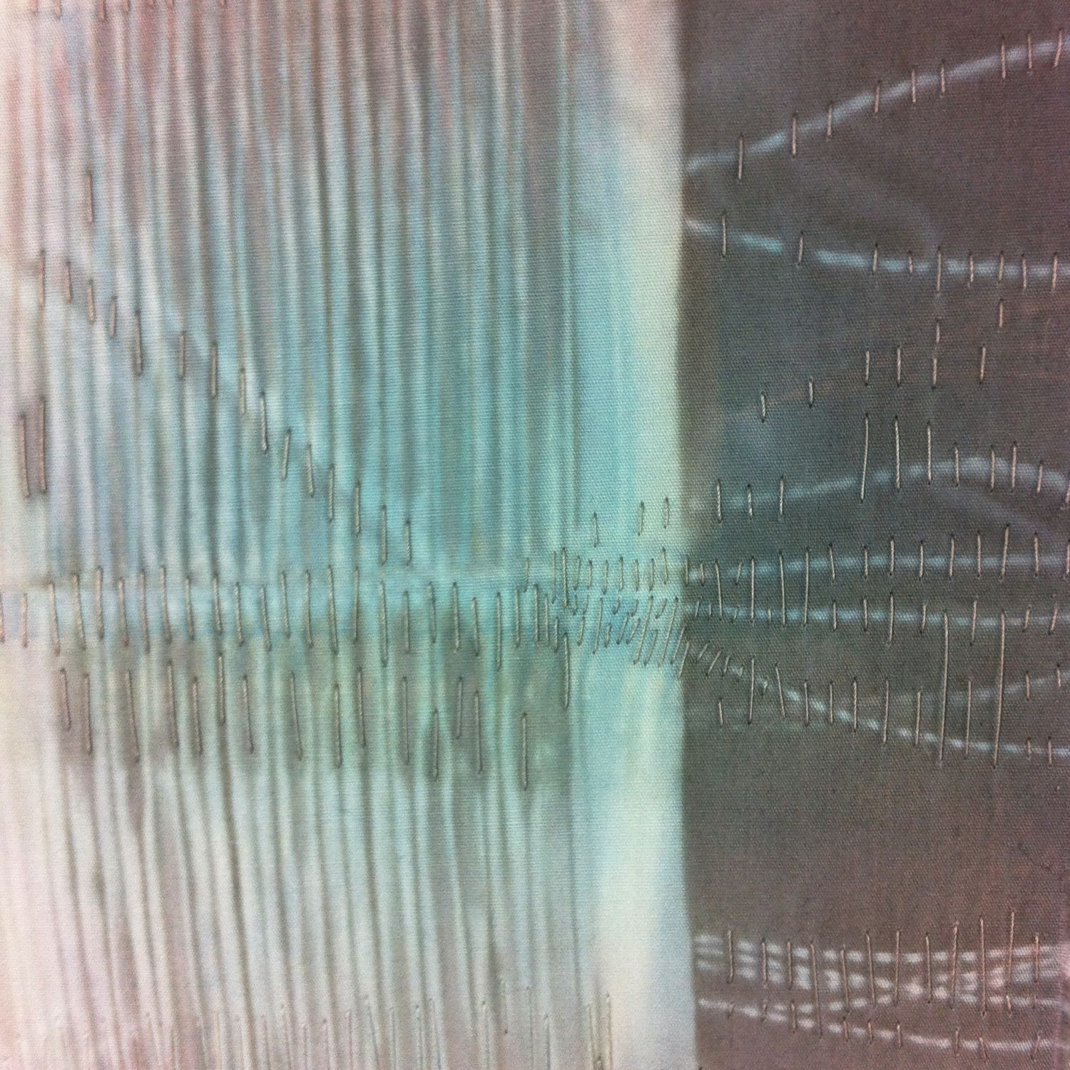
I like the integrity of work where the stitches that hold it together are visible and part of the finished effect, but I also like my stitching to work with (not against) the dye marks on the cloth.  However I'm not an embroiderer - in the sense that my stitches aren't meant to dominate or be the design itself.  For me I think it's about adding another layer of marks. 

Visually, if there is no stitch, then the cloth and the dye marks have to do all the work.  They have to tell the whole story on their own.  If there is to be stitch, it has to add something to the story told by the cloth and the dye.  An additional element of mark, texture, line, that builds upon what is already there.  Maybe by emphasising or enhancing existing textures, marks (a harmonious strategy) or maybe by adding a contrast or counterpoint (a complementary strategy).  But unless the stitch is to become the dominant feature it has to integrate with what's already there, not take over.  

On the other hand, if the stitching is to be the dominant feature, then it pushes the cloth / dye marks into the background.  As though they become the background scenery rather than the tale itself.  In which case there needs to be enough stitching - or a strong enough contrast - for the story the stitch is telling to be read against the background.  

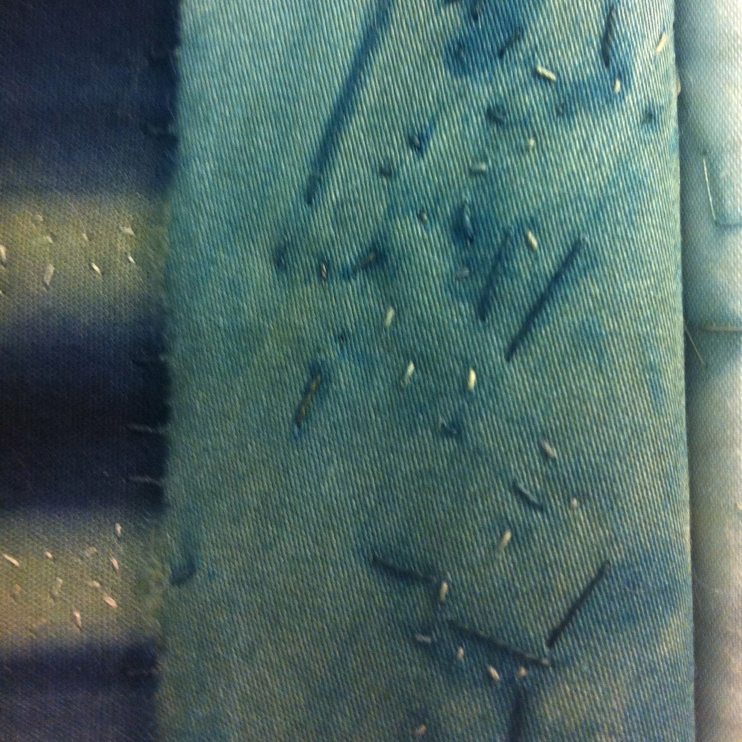
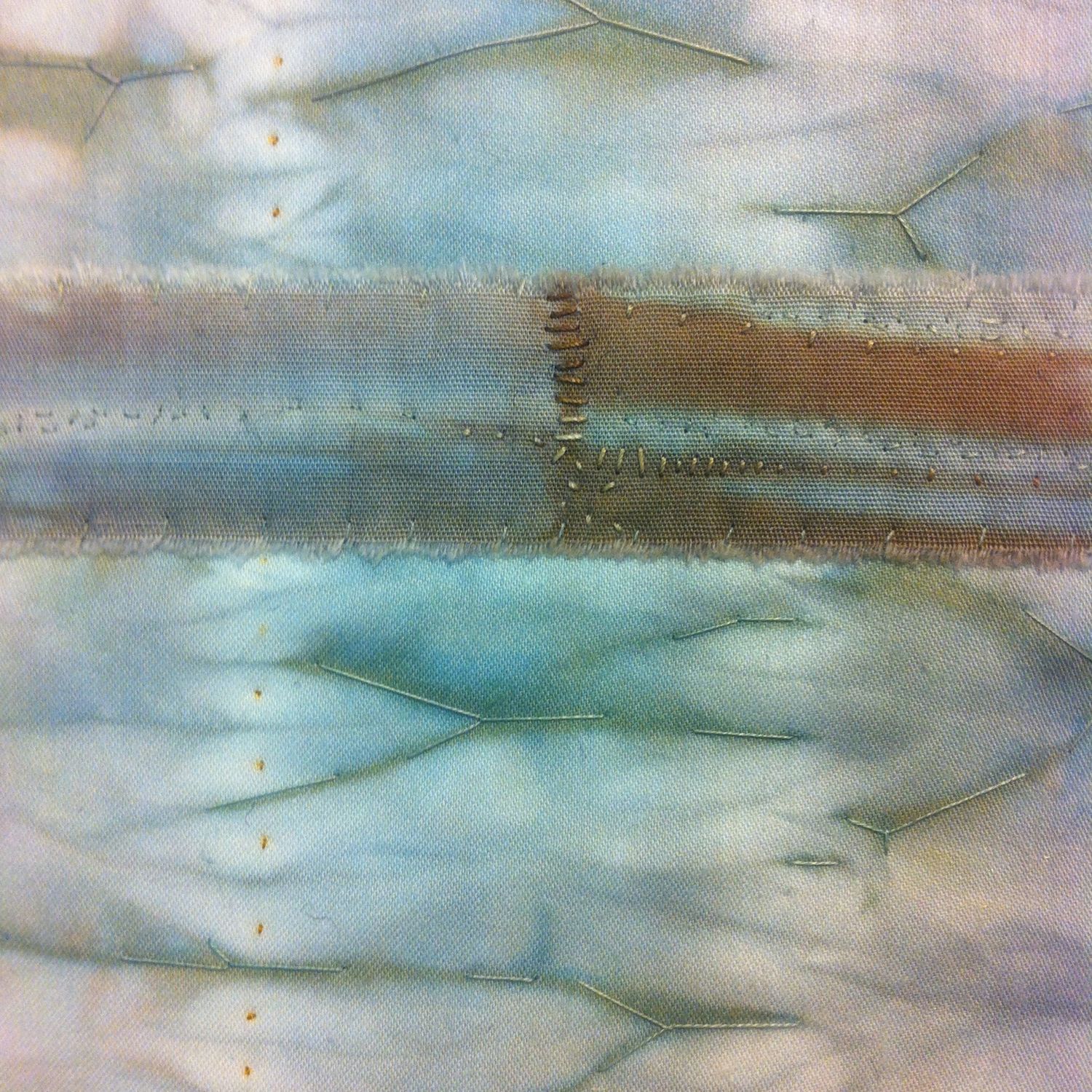
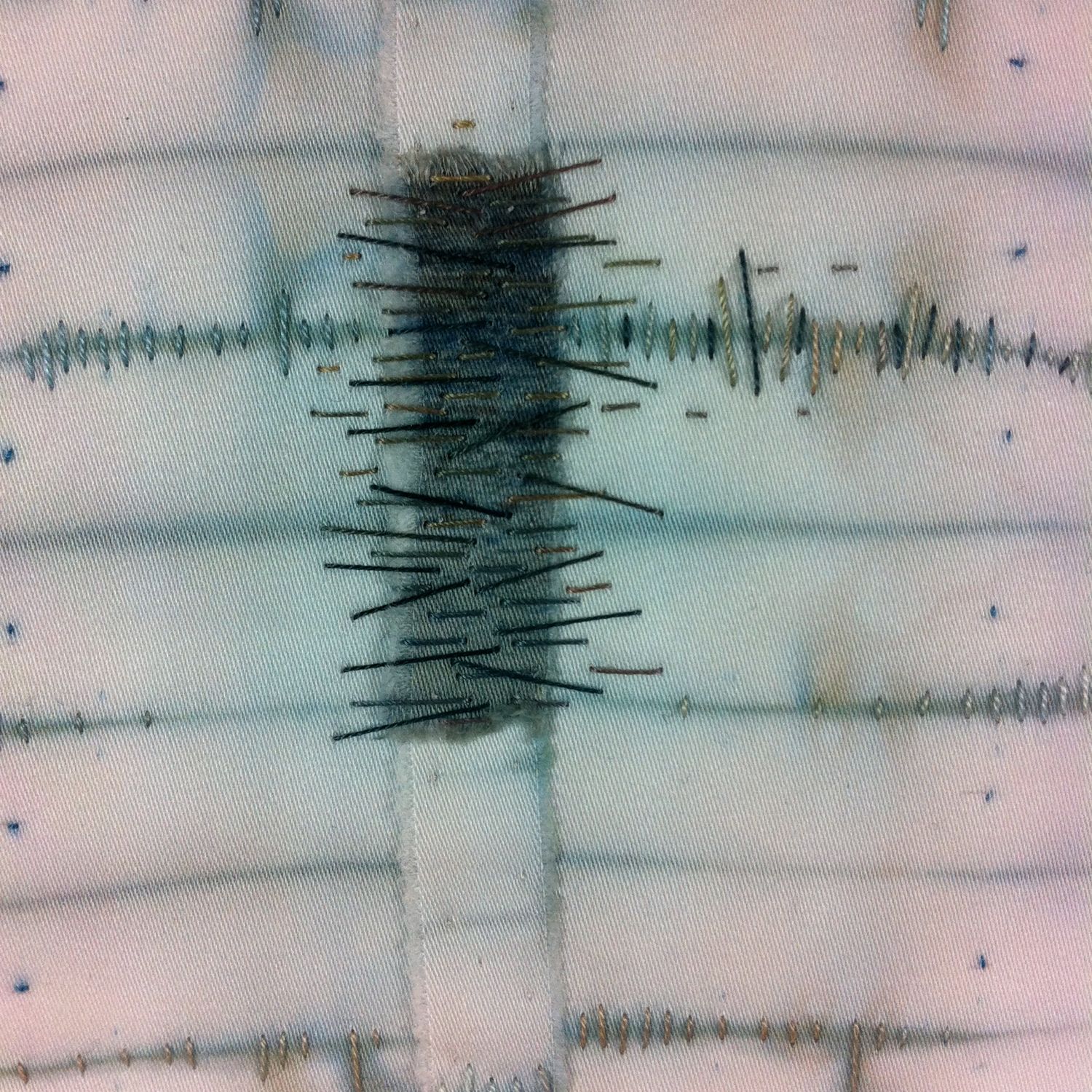
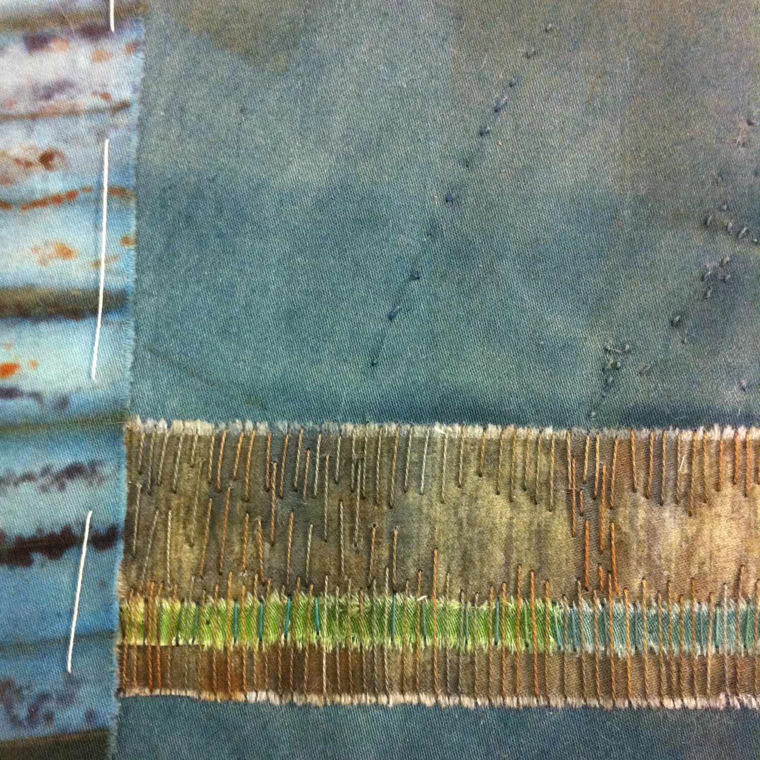
I finished one piece this week.   About to start another.  It may require a new playlist.   Meanwhile here are some close-ups of the stitching from two pieces.  


The plan of what might be

Sometimes he feels as though the plan he is holding in his head is so fragile that the slightest jolt might make it come apart. In the five months that have passed since he stood before it at St Gall, the fabric has become eroded as though some earthly edifice had been left out in the rain. Even on the journey back he felt that he was losing it. … With every breath the memory becomes fainter. …
— Charles Ferneyhough "Pieces of Light" Ch. 7

The Plan of St Gall is a manuscript, "five sheets of parchment sewn together with green thread", depicting an entire Benedictine monastic complex.  It was never built and scholars argue about the original design, purpose and nature of the plan.  Ferneyhough is interested in it as a possible example of a mnemonic device, using the Method of Loci , which uses visualisation to create a framework to organise and recall information.   In this method, which was known to the Greeks and Romans, the individual memorises the layout of some building or place, linking the items he wishes to recall to distinctive features of that place.  When he wishes to remember, meditate or reflect upon the material, he literally walks through the place in his imagination, allowing the features and layout of the imaginary building to awaken memories and associations.  He "sees" his thoughts.  
Ferneyhough's point is that this is a view of memory as something more than simply memorising facts - it is a creative, constructive process in which the meditator (quoting the 12th century Hugh of St Victor) "delights to run freely through open space … touching on now these, now those connections among subjects" in order to generate new thoughts as much as remember existing ones.   
More on this idea - Mary Carruthers "The Book of Memory"

His thought is a multicoloured pageant, of ideas behind words behind images, combining and recombining like clouds on a windy day.
— Charles Ferneyhough "Pieces of Light", page 140

All about … brown

Brown is the colour you don't want when you're colour mixing, right?  Mix three primaries together and you end up with "mud".  But … adding brown is also a good way to neutralise bright primary dyes to get subtle, earthy colours.  I've always used a pre-mixed black and a dark brown dye alongside my six primaries to tone things down.  

Until last summer I was happy to just use the dark brown I buy straight from the jar.  But then I had a defective batch  … and of course I only realised after I'd dyed several metres of cloth the wrong colours.  So, I decided it was time to learn to mix my own.

Well.  There are 21 possible combinations of six primaries (if you use both the reds, yellows and blues together as well as separately).  And then there are several possible ratios of each possible combination that could result in something brownish …   But after a lot of experimenting I ended up with some really interesting … greens, reds, plum, violet … amazing how often you can mix all three primaries and not get "mud".  But there were also lots of browns.  

Which was great, but now I need to narrow that selection down to two or three that I can use regularly.  

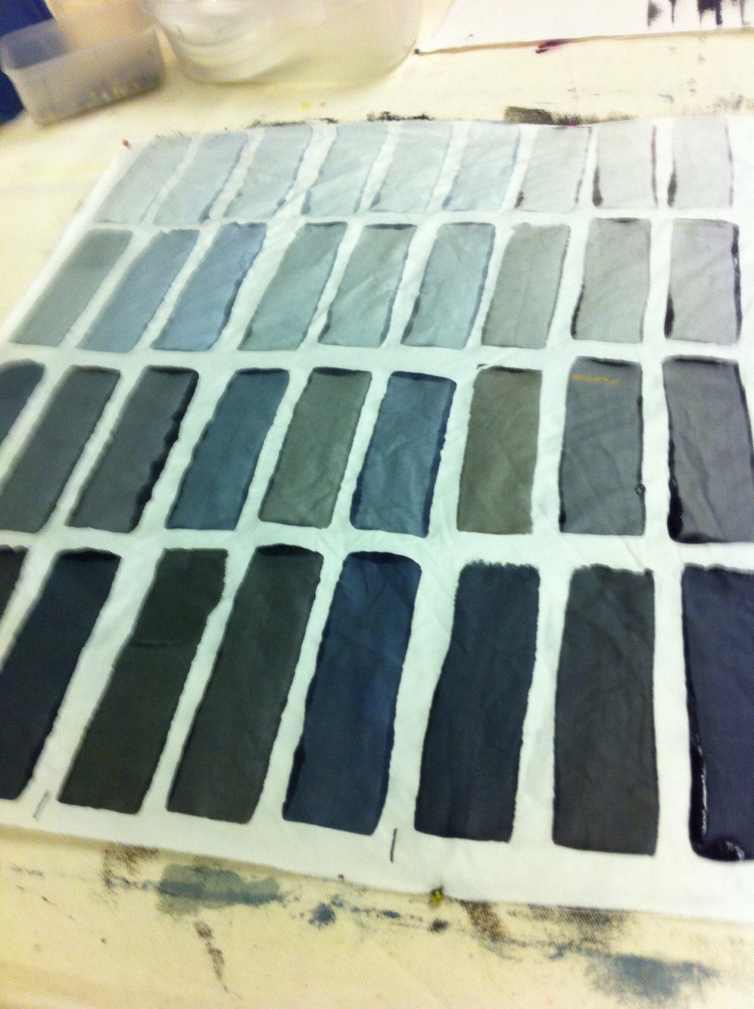
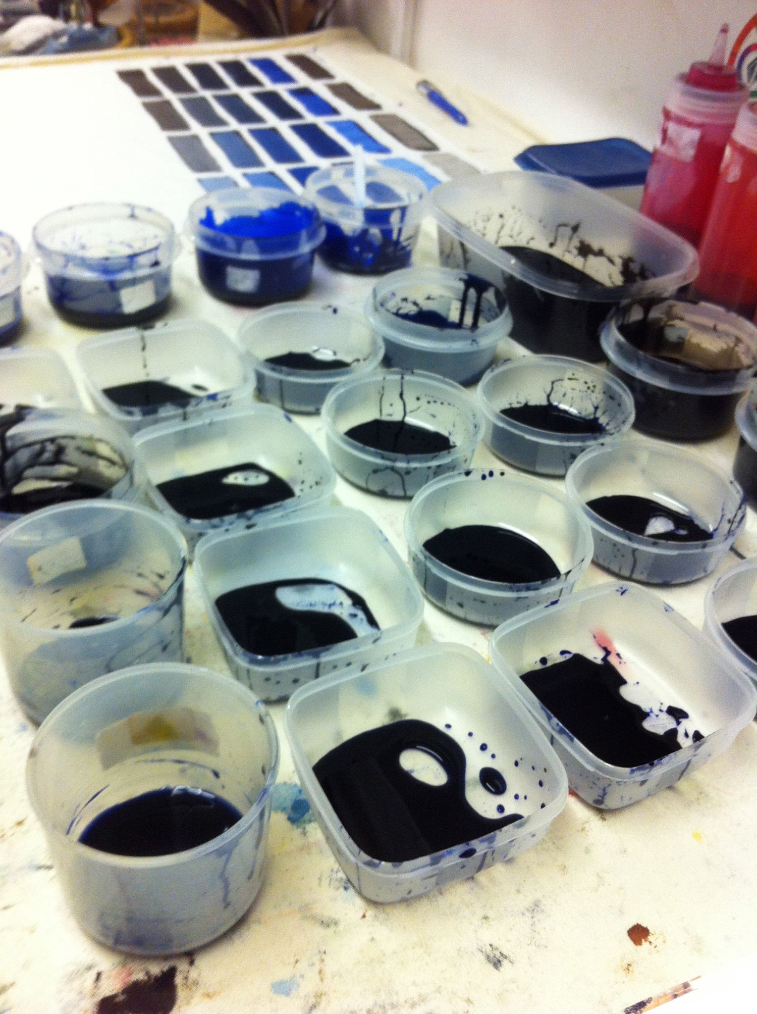
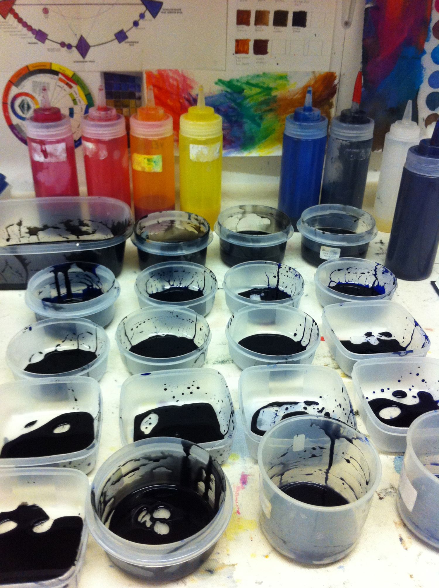
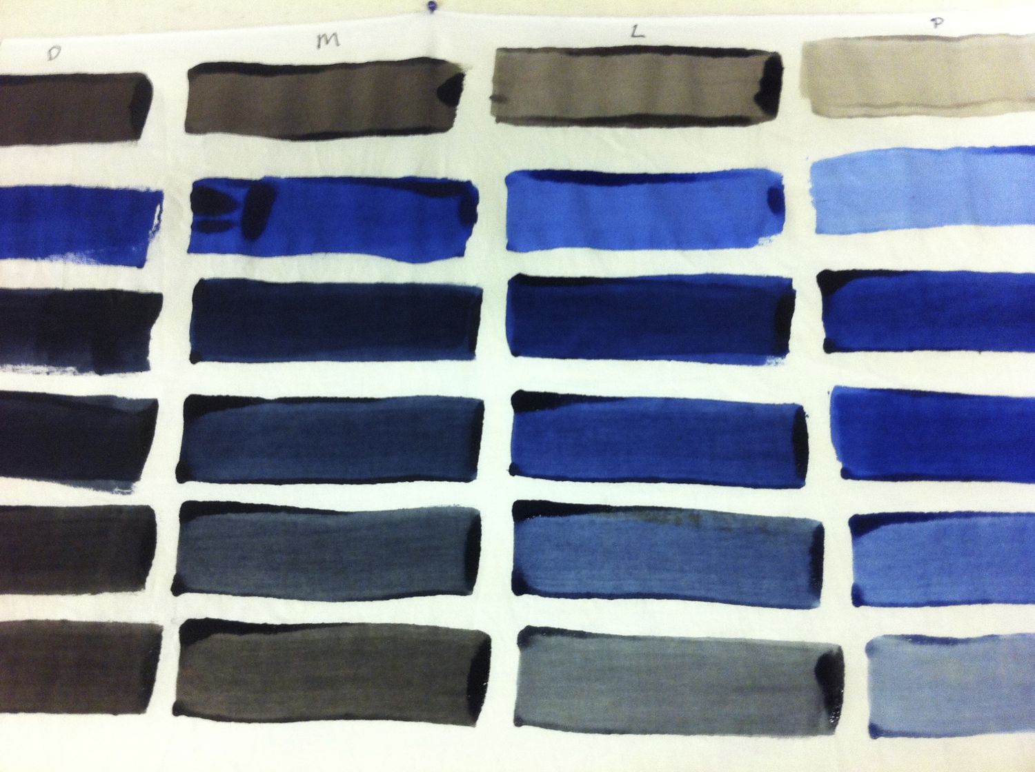
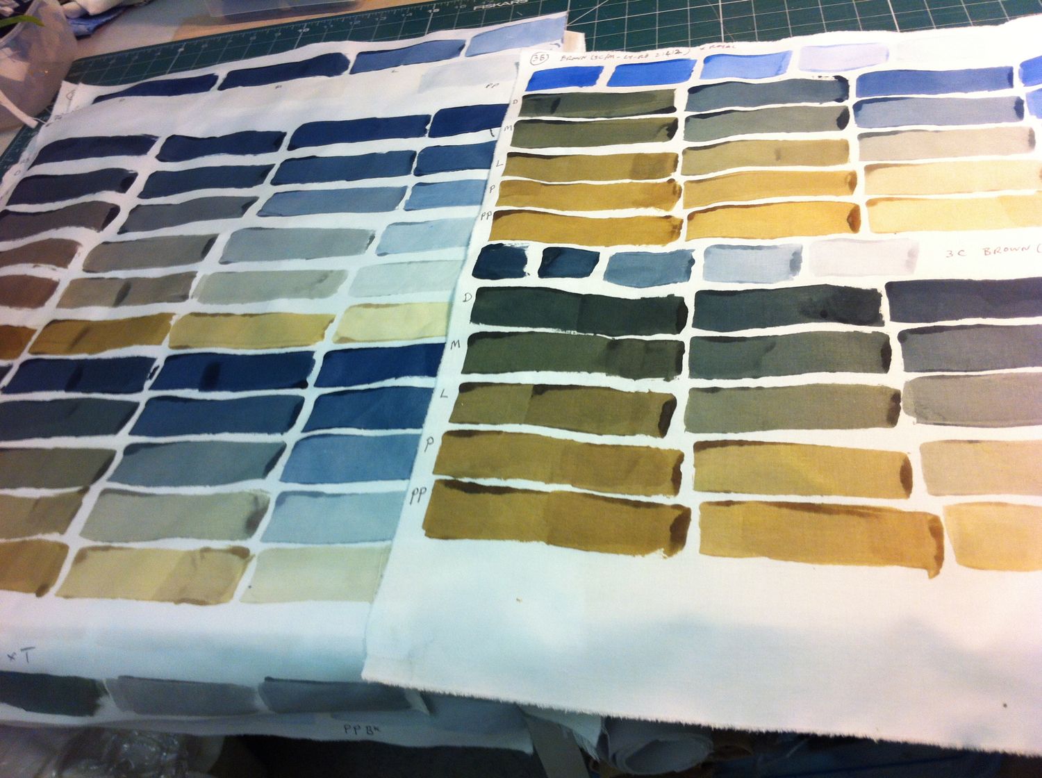
So I spent Christmas playing with dye.  Not unusual in my household.   I chose a few candidates from my now vast selection of browns and tried mixing them with blue or black.  I was looking for the ones that would give me a palette with lots of cool toned neutrals (and not too much red or green).  

It was hard to mix consistent shades when the combination required several dyes so, now I know that for practical purposes I need mixes that use no more than four.   

These are the results.  I was really pleased with the palette I mixed from the last batch - some lovely greys and cool toned browns.  

Dye Book

Dye Book

Favourite on the right

Favourite on the right

I still need a good reddish brown - but I need my studio back ….